WordPress 6.1: Enhancing the full-site editing experience

Have you heard the news? WordPress 6.1 is out! Welcome to the third and last major WordPress release of 2022. This release continues to build, iterate and refine the full-site editing experience introduced in WordPress 5.9 earlier this year. It brings us new possibilities to easily change up the styling of our website, spice up our page design, and other improvements to our favorite open-source platform. Let’s take a closer look at what 6.1 brings to the table!
This release is a step in the right direction for full-site editing. Full-site editing and block themes arrived to WordPress with the promise to put more control in the hand of users, allowing them to do more with creating and designing a website. Version 6.1 is on track to deliver this promise. We’re seeing a release that focuses quite heavily on providing customization options and enhancing the site-editing experience.
WordPress 6.1 introduces more than 2,000 updates since the release of WordPress 6.0 in May 2022. All the gains, enhancements, and improvements from version 13.1 to 14.1 of the Gutenberg plugin were committed to core. Since we can’t possibly cover all the updates in a single article, we’ll focus on several notable changes instead.
More control over your global style preset
The global style interface was first introduced in WordPress 5.9 and received a lot of attention and praise. It allows you to easily switch up the look and feel of your website. In just a few clicks, you can change the color palette of your entire site or change the default font, size, and color of your text and links. WordPress 6.1 brings even more customization to the global style interface. You can now determine presets for:
- The default appearance of typography for headings and buttons
- The default colors of headings and buttons
- The width of the main content area and block spacing in the global layout
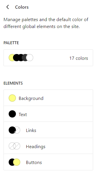
All of this is great for design consistency. And that’s not all. You can even configure the default appearance for specific blocks, which allows for even more creativity in designing websites. Let’s say you want texts in the ‘list’ block to always be in the color green, you can easily do that now.
It’s good to note that the global style feature is only available on block themes, so you won’t see this option if you’re running a theme that doesn’t support full-site editing.
Twenty Twenty-Three default theme: powerful style variations
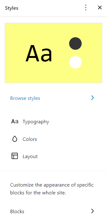
WordPress is determined to provide more design controls to users, which is reflected in the new Twenty Twenty-Three (TT3) default block theme. The new theme is designed to leverage all the new design tools introduced in 6.1. When you first install this theme, it may look a bit underwhelming with the default style, but there’s a lot more than meets the eye.
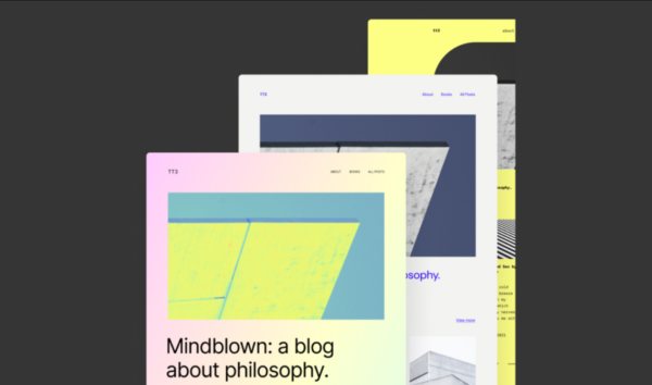
Going into customizing TT3, you’ll find that it actually comes with 10 style variations for you to play around with. These variations were selected from a wide range of entries from the community. What’s impressive is that each of these variations is totally distinct from one another. Each variation has its own color palette, typography, layout,…. and they all look amazing.
Previously, the default WordPress themes were a bit underwhelming when talking about their appearances. Many people would choose a third-party theme because they look better and offer more customization possibilities. TT3 may change that. The new 10 style variations may just satisfy the needs of many, especially bloggers and small website owners. Not to mention, this theme may set an example for other themes, paving the way for more style variations in non-default themes and making it a standard to have multiple variations.
Multiple enhancements in design tools
The design tools in the post editor are getting lots of improvements and enhancements, allowing you to get finer control of your page’s design and layout. WordPress 6.1 also brings consistency to the availability of design tools for different blocks. And it’s good to know that you can also override any global settings with adjustments made in the design tools in the post editor.
Dimension control in more blocks
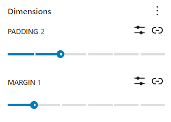
WordPress 6.1 brings dimension control to blocks like paragraph, list, table, and more. In the sidebar of the post editor, you’ll find a section called “dimensions” where you can leverage this new enhancement. Don’t forget to check the 3-dot menu to see if any settings are hidden. For instance, you can now control the padding of the paragraph and group block. For the column and gallery block, it’s possible to control the spacing between elements in these blocks.
Border control improvements
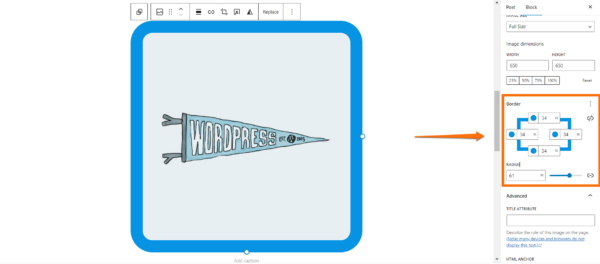
This release also adds border support for more blocks and allows users to adjust the top, bottom, left, and right border separately. For instance, when using the gallery block, you can determine the border and its radius for each image in the gallery. And you can add actual borders to images, which was unavailable previously.
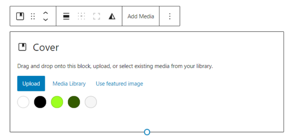
Featured image in cover block
You can now easily add your featured image to the cover block, allowing you to conveniently use the featured image anywhere on a page. When you add a cover block, there will be an option in the toolbar that lets you grab the featured image.
Visualizer for padding and spacing
There’s a real-time visualizer to help users with adjusting dimensions. It conveniently shows you how changes affect your page layout as you’re making the change. Pretty handy for retaining layout and design consistency.
Fluid typography
Another design improvement coming in this release is fluid typography. This feature allows theme makers to configure text to automatically scale depending on the screen where it’s viewed. Of course, websites nowadays are responsive so text does scale and resize according to screen sizes. But the problem is that it only scales to specific screen sizes, so text on anything outside of those pre-determined sizes won’t scale properly.
On the other hand, fluid typography lets you resize text smoothly to match any device’s width. However, this feature is opt-in, so it only works if theme makers decide to implement the feature. It also works on blocks that support typography control, of which list you can find here.
New templates in the site editor
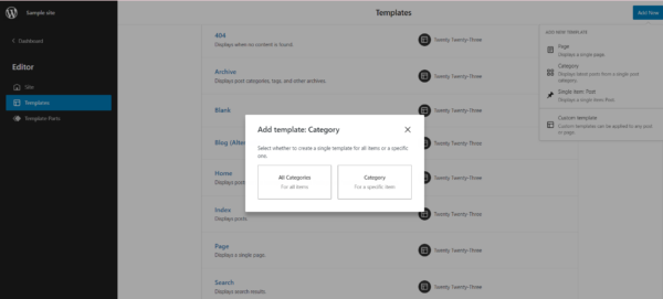
With full-site editing, you get a new editing experience with the “site editor” instead of working with the theme customizer tool. In the site editor, you can create templates for various pages, including your homepage, single post, 404 page, and search result page. The template creation experience has been expanded in WordPress 6.1, allowing you to create custom templates to use on any type of post or page. In addition to that, you get finer control over some of the templates that you can create, including:
- Post: You can choose to create a single template for all posts or for a specific one.
- Page: You can now create a template for pages and determine which page will use this template.
- Author: You can create a template to use for all authors or for a specific one.
- Category: Similar to the post template, you can create a template for all categories or for a single category.
Inner block editing capability
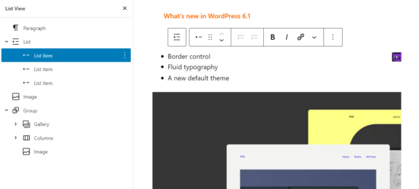
Inner block editing is a new feature coming to the quote and list block. As the name suggests, it’s now much easier to separately edit elements within the quote and list block. This is a quality-of-life improvement, especially for those who often work with the list block.
For instance, let’s say you want to move an entry up or down in your list. All you need to do is click on that entry, which prompts the toolbar to appear, and click on the arrow to move it up or down the list. Another way is to use the list view. Entries in a list block will also be displayed as separate elements in the list view instead of aggregated into a single element.
Content-only block editing
WordPress 6.1 introduces an experimental feature called content-only editing for blocks, patterns, and templates. When this feature is enabled, users can only change the content inside a group of blocks, patterns, or templates. The idea is to prevent users from accidentally breaking the page layout or changing the styles.
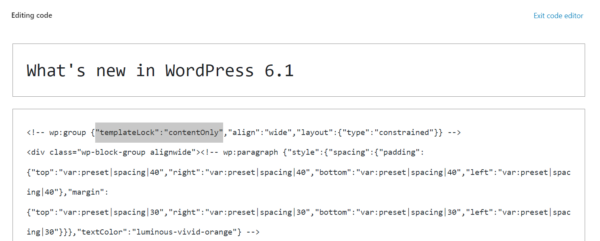
At the time of this release, content-only editing is not accessible from the Visual editor interface. You would need to use the Code editor interface to enable it. You can do this by navigating to the 3-dot menu at the top right of your post editor and selecting “Code editor”. The next step is to set the templateLock attribute to contentOnly like in our example below.
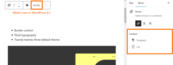
You’ll notice that when content-only editing is enabled on a group of blocks, the sidebar changes as well. You won’t see the usual controls but a list of blocks included in the group. You can select any of those blocks by clicking on the block in the editor or on the corresponding item in the sidebar. If you have the list view open, clicking on this group of blocks in the list view will prompt the toolbar to appear. Clicking on the “Modify” button will temporarily disable content-only editing and bring back all the design tools.
Performance improvements to the WordPress platform
This release brings some significant performance improvements and many smaller ones to the WordPress platform. More than 25 tickets were dedicated to making WordPress faster and more efficient. If you want to learn about these enhancements, we’ve written a dedicated post about the notable performance improvements in WordPress 6.1. Check it out!
All in all, performance improvements are always welcomed by the community. They indicate that WordPress as a platform is getting faster and becoming more efficient, which is beneficial for SEO. Since search engines tend to favor fast websites with good user experience, the more efficient WordPress becomes, the more advantages WordPress sites have when competing for a spot in the SERPs.
Other small improvements and enhancements
Cross-device preference in the post editor
In the sidebar of the post editor, you can select preferences for how your editor should look when you’re working in this environment. For example, some people like to focus on the block they’re working with, so they select the “spotlight mode” in the view setting. Unfortunately, these preferences are only saved locally in previous WordPress versions. A bit inconvenient for those who use multiple devices, if you ask us. WordPress 6.1 enables cross-device preferences so your settings are saved and you’ll have the same editing experience on other devices.
Small changes and additions to the post editor
The UI of the post editor gets a small update in this release. The following changes and additions won’t have a big impact on your workflow, but you might take some time to get used to them:
- The Preview button becomes “View“
- There’s a new “time to read” feature in the “Details” section of the top bar
- The previous “Status & Visibility” section is now “Summary“
- The new “Summary” section now contains the post’s URL, post format, and template
Block parts to use in classic theme
The post editor of WordPress 6.1 gets a new section called “Template parts”. Basically, you can create templates for parts of a page, export those templates, and use them in a classic theme. WordPress 6.1 lets you create template parts for the comment section, header, footer, post meta, and general templates that are not tied to any area.
Though this new feature seems useful, it’s quite cumbersome in practice. You would need to do a bunch of things to make the template parts work on a classic theme. Should you want to test this feature out, you can find instructions and resources in this thread.
Time to update your WordPress to get the latest features, improvements, and security updates! To ensure the update works as intended, make sure to test it on your staging site to see if there are any conflicts with your themes or plugins. Happy updating!


Discussion (1)