How to build exceptional product pages in Shopify

If your online shop is hosted on Shopify, you’ll know that it helps you easily manage your online shop and make sure it looks good. However, picking a fresh design is not the only thing you need to think of when it comes to your pages. Sure, it helps when people are impressed by the design of your page, but they also need to be able to find all the product information they’re looking for. That’s why, in this blog, we’ll list 9 must-haves and help you craft exceptional product pages in Shopify.
Changing the layout of your product pages
Before we dive into what your product pages should look like, it’s good to know that you can actually determine the layout of your product pages in Shopify. From your Shopify admin area, just go to ‘Online store -> Themes’ and click ‘Customize’ next to your current theme. At the top of your page, you’ll see a drop-down menu that’s probably set to ‘homepage’. Switch that to ‘Products -> Default product’.
You’ll get a preview of what your product pages look like with a menu on the left. This menu shows you all the elements of your product page. You can actually move the order of them by clicking on the six dots next to any one of those elements. Play around with it to see what works for you, but don’t get too carried away with it. People are expecting a certain layout on your product page and you don’t want them searching for the buy button that you’ve hidden at the bottom of the page.
9 must-haves for your product pages in Shopify
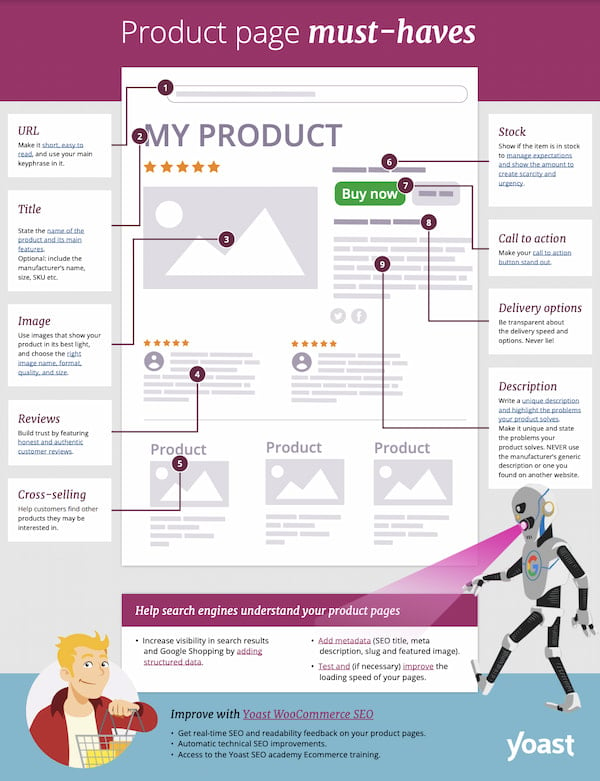
Of course, not all product pages need to look exactly the same. What an ideal product page looks like highly depends on your type of products, your company, mission and other factors. But there are a few things every product page should have. Not only so that people can find the information they’re looking for but also to increase your sales.
To give you an idea of these must-haves, we’ve created a PDF that gives you an overview of the elements. You can download this PDF but we’ll also go over them one by one right now.
1. User-focused and SEO-friendly URLs
You might not spend that much time on your URLs, but there are a few things you can do to optimize them. Both for your users and the search engines. First of all, make them focused by stripping them of function words but keeping them readable at the same time. It’s a good idea to have your main keyphrase in the URL, which will often be the name of your product. These are just a few of the best practices when it comes to user- and SEO-friendly URLs.
You can view and edit your URL by going to the product in your admin area of Shopify. Simply scroll down to the Search engine listing preview and click on ‘Edit website SEO’. With that, three fields will appear and in the bottom one, you will find the current URL of your product. You will only be able to edit the last part of your URL, but that’s okay, that’s exactly the part you want to edit. Fill in the new, optimized URL and hit save. If the product page is already live, you’ll immediately get a notification that Shopify will create a redirect from the old URL to the new URL, with the option to uncheck this. But we would recommend leaving this field checked, as it helps people who saved your old URL land on the right page.

2. An optimized product title
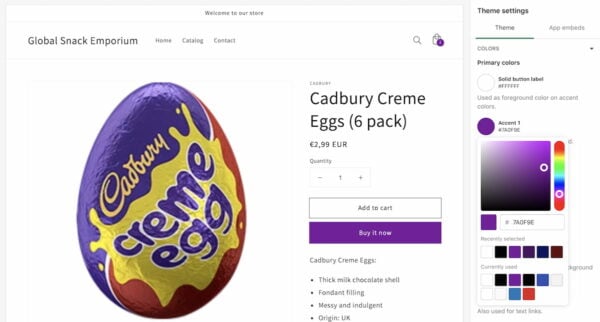
The title of your product will be one of the first things page visitors will see. And it also helps search engines find out what your page is about. So you need to make sure that it features the most important thing: the name of your product. But, depending on your product, there’s more. It can be wise to add the brand name to your product title, or the number of units that someone is buying. As we’ve done in this example of a product title: Cadbury Creme Eggs (6 pack).
For other products, it can be helpful to add the dimensions, size, or even the SKU when it’s a more well-known product. What you need to add to your product titles partly comes down to common sense, because you don’t want to overstuff your product title to the point that it becomes unreadable. Just remember to at least add the name of your product.
You can add and change the title of your product by going to the product in your admin area in Shopify. When you click on the product of your choice, it will be the first field you see on your edit screen named ‘Title’. Simply fill in the optimized title in that field and click save. That’s all!
3. Great images of your product
Another thing that people will spot right away when landing on your product page is the product image. We want to stress the importance of these images, as they show people exactly what they get with this product. So use attractive images that reflect the product well. If you have multiple images, make sure to add them and if you have images of your product in action, also add those! Is your product not easily photographed or does your shop offer services? Get creative and add images that give people an idea of what you’re selling. And when you add images to your page, choose the right image name, format, quality and size.
When you’ve taken the right preparations, adding images to your product page is quite easy. Just go to your product page in the admin area of Shopify and scroll down to the field with the name Media. Here you can add images that you have stored on your computer by clicking ‘Add files’ or dropping the files there right away. Or you can add images from a URL.
4. Authentic customer reviews
A great (and easy) way to build trust is with reviews. And by reviews, we do mean real reviews, written by actual customers who have bought your product. You might not think it worth the effort, but reviews are a great example of how well social proof can work. Social proof is a mental process in which people copy the behavior of others in an attempt to reflect correct behavior. In addition, search engines also love seeing happy customers talking about your products. So make it possible and put in some effort to get reviews for your online shop.
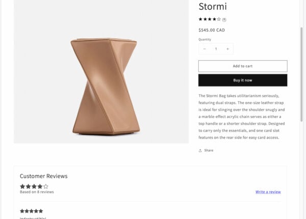
Making it possible for people to leave reviews about your product is a piece of cake in Shopify. One of the apps that you can use to do so is the (free) app Product Reviews. The app comes with installation instructions on how to properly set up the app and with it, you can show reviews, manage them, reply to them and edit the layout of your reviews.
5. A cross-selling section with recommended products
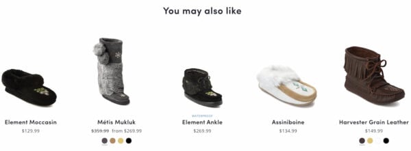
A great way to showcase your other products and increase your sales is by using cross-selling. This is a sales technique used to get customers to spend more by highlighting products that are related to what they’re buying or viewing at that moment. This helps customers discover new products and can increase your sales. You will probably have noticed it yourself when browsing products online. Normally, they’re shown below or next to the product with a title like ‘You may also like’ or ‘Other people have also bought’.
In Shopify, there are a few free themes that allow you to a section with product recommendations. This section displays a few (automatically-generated) recommended products. To enable this, you go to ‘Online Store -> Themes’ and click ‘Customize’ in your current theme section. Change ‘homepage’ in the dropdown menu at the top to ‘Products -> default product’ and click ‘Product recommendations’ in the menu on the left. Check off the ‘Show dynamic recommendations’ setting and change the other settings if you want to. Don’t forget to click save.
If your theme doesn’t support this Product Recommendations section, or if you want to have more options, there are other apps that you can use. Just go to the Shopify app store and search for ‘cross sell’ or ‘cross-selling’. This will give you loads of options to choose from.
6. An up-to-date amount in stock
It’s a good idea to keep your stock up to date on your product pages. Not only does this prevent very disappointed customers if you’re out of stock, but it can also give people a sense of urgency if you only have a few products left. This helps you create scarcity, which encourages people to buy your product. That being said, do be honest about your stock as people will notice it soon enough if you’re not being genuine.
Luckily, keeping your stock up to date is quite easy in Shopify. Simply go to your product in the admin area and scroll down to ‘Inventory’ and fill in the number of available products below ‘Quantity’. Make sure that the box ‘Track quantity’ is checked so that your stock is automatically updated when someone buys one of your products!
7. A call-to-action that stands out
The call-to-action on your product page is probably always your buy button. And for people to easily recognize it, you need to make sure it stands out. In a good way. It needs to stand out from the rest of your page and not disappear into the background or go unnoticed because of other colorful elements on your page. Use a striking color, create buttons that actually look like buttons and use active text. And use plenty of whitespace around it to make sure it takes center stage.
You can actually change the design and text of your button by customizing your theme. Go to ‘Online store -> Themes’ in your admin area and click on ‘Customize’ next to your chosen theme. On this page, you’ll see ‘Theme settings’ at the bottom of your left-hand menu. When you click on that, you’ll get a new menu on the right side, click ‘colors’ to change the colors for your buttons. Don’t forget to save. The text on your buttons can be changed per page.
8. Accurate delivery information
Another piece of information that people will be looking for on your product pages is information about delivery. Be transparent about the delivery speed and options. And be honest. It’s good to have this information on your product page, where people decide whether or not to hit that buy button. It can help them decide if they’re going into business with you at that moment. In addition to having this information somewhere on your product pages, we recommend having a dedicated page that gives information on your shipping policy and delivery options.
So, how can you add delivery information to your product pages in Shopify? Well, first of all, you can decide to add it to your product description per product. Adding a simple sentence like Delivery within 1-2 business days can be enough. But it’s important to keep this information up to date! You can also choose to add delivery information to the header of your website. Simply go your admin area, click ‘Online store -> Themes’ and then click ‘Customize’ next to your current theme. At the top of the menu on the left click the ‘Announcement bar’. Here you can add an announcement that will be shown on all of your pages.
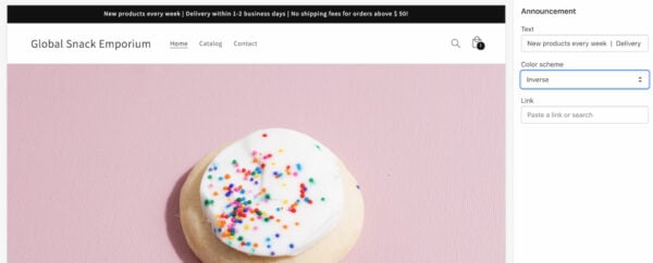
But these are just two suggestions. Because Shopify lets you change the layout of your product page, you can also decide to show this information somewhere else on the page. Get creative with it and find out what works for you!
9. A unique and appealing description
When it comes to the description of your product, it can be very tempting to just use the one given by the manufacturer. Or a description of your product that you found on another website. We’re here to tell you that you should never do that! It’s so important to write your own description and highlight the problems that your product solves.
Let’s start with why you shouldn’t use the description that’s provided by the manufacturer. Many other websites that sell the same product will use these descriptions. For one, this leads to duplicate content, which makes it difficult for Google to decide which website is better. It makes it very, very hard for you to stand out when your description is just like anyone else’s. But that’s not all. Your site visitors are also looking for unique descriptions that tell them more about the product that you’re selling. And especially how it can help them solve a problem they’re facing. Don’t underestimate the importance of a tailored product description!
Now we realize that coming up with a unique description is not easy for every product that you sell. Especially when you sell lots and lots of products. But if you have the possibility to write descriptions that stand out, even just a bit, invest the time. And if you have loads of products, start with the most important ones and work from there.
Adding a product description in Shopify is easy-peasy. Just go to the product of choice in your admin area and one of the first fields you’ll see is ‘Description’. Here you can fill in or edit the existing description. As we said, focus on how your product can help people and why it’s so awesome. There are a few other best practices that can help you write great product descriptions, and here to help you with that is the Yoast SEO app in Shopify.
Make your product pages findable with Yoast SEO!
Yoast SEO is an app that you can add to your Shopify website. It makes sure your online store meets the highest technical SEO standards. But that’s not all. It helps you optimize your pages by giving you feedback on the findability and readability of these pages. With this feedback, you can get your pages higher in the search results and improve your sales by writing texts that your site visitors will love!
So, how does it work? Well, when you’ve installed the Yoast SEO for Shopify app and want to work on one of your product pages, just go to that product. Click on ‘more actions’ in the top right corner and select ‘Optimize in Yoast SEO’. This will send you to a more focused edit screen where you’ll see your product title, description and images. That’s because Yoast SEO will help you optimize these elements.
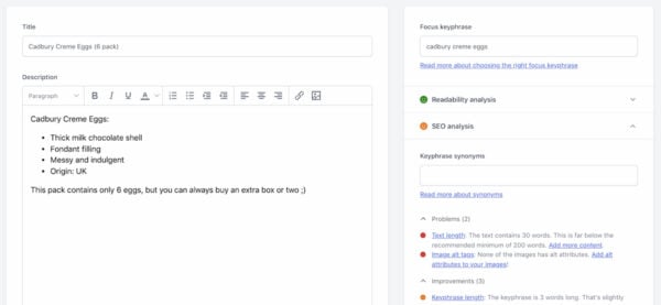
The screenshot above shows you what our app looks like in Shopify. It has several tabs that you can extend and that help you work on different things. At the top, you can fill in the focus keyphrase of choice and this helps our SEO analysis give you the right feedback for that keyphrase. When you click one of the tabs, you’ll get more information on what you can still improve on with the use of red bullets (problems that need to be solved), orange bullets (things that can be improved on) and green bullets (which means you don’t have to do anything with those parts!). You’ll notice the same bullets in our readability analysis.
Now the idea is not to get every single bullet green, especially if that means that your text doesn’t flow naturally anymore. But you should aim to get the overall bullet for readability and SEO green. This will improve the quality of your text for site visitors and Google!
What else can Yoast SEO help you with?
Below the readability and SEO analysis, our plugin has other tabs that you can use to change how your page is shown on Google, Facebook and Twitter. With these tabs, you can edit the page title for these platforms and add a meta description (text that is shown alongside the URL). For Facebook and Twitter, you can also change the image that is shown. And it’s good to know that the image you use in your Facebook preview will also often be picked up by other social media platforms.
There’s also a Schema tab, that gives you more information on why our app adds that to your pages and how it helps search engines understand your pages even better. Below that, you’ll find the Advanced tab that you can use to change some settings of your page, like putting your page on no-index and setting up Canonical URLs. But all of these options come with more information on when and why you should use them! Below that is the cornerstone product content tab, which you can use to mark product pages as your most important content.
Read more: 7 tips to get more traffic to your Shopify store with SEO »
Conclusion on product pages in Shopify
So, let’s summarize what we discussed in this blog post. Optimizing your product pages in Shopify can both increase your sales and get you higher up in Google’s search results! To get there, there are a few must-haves for your product pages: focused URLs, optimized product titles, great images, authentic reviews, cross-selling, a representation of stock, noticeable call-to-actions, delivery info, and a unique product description. We’ve actually created an infographic with all of these must-haves for your product page (PDF) that you can download and look at whenever you’re working on your pages!
The Yoast SEO for Shopify app makes optimizing your product pages a lot easier, by giving you feedback the SEO and readability of your content and other related things. It also gives you more control over your pages and what they will look like when they’re being shared. So if you want to step up your game and create pages that site visitors and Google will love, check out our app!
Keep reading: How to write great product descriptions in Shopify »


Discussion (2)