How to write a title with an optimal width for SEO
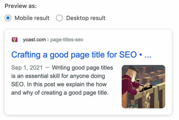
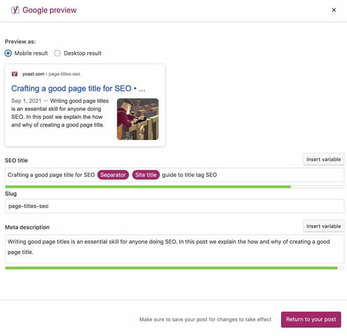
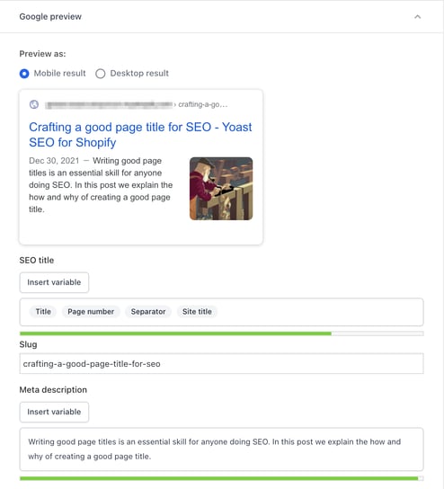
If your title doesn’t have the right width, parts of it may be cut off in Google’s search results. How the result looks may vary, depending on the device you’re using. That’s why you can also check how your SEO title will look in the mobile and desktop search results in the Google preview in Yoast SEO. The tool uses the mobile version as a default, but you can also switch to view it in the desktop version.
Here’s a desktop result:

And here’s the mobile result for the same URL:

Width vs. length
Have you noticed that we talk about width rather than length? Why is that? Rather than using a character count, Google has a fixed width for the titles counted in pixels. While your title tags can be long and Google doesn’t have a set limit on the number of characters you can use, there is a limit on what’s visible in the search results. If your title is too wide, Google will cut it off visually. That might not be what you want. Also, you should avoid wasting valuable space by making the title too short. Not only that, the title often informs other title-like elements, such as the og:title , which also have display constraints.
Luckily our Google preview can help you out! You can fill in your SEO title and our plugin will give you feedback straight away. The green line underneath the SEO title turns red when your title is too long. So keep an eye on that, and use the feedback to create great titles.


Bullet turned green?
Well done! You just gave your site a chance to stand out in the search results!

