Gutenberg An alternative approach

There’s a lot of discussion in the WordPress world right now about a new editing experience that’s in the making. It’s called Gutenberg. While some of that discussion is technical, every user that uses WordPress regularly should be aware of what’s coming. At Yoast, we are quite excited about the concept of Gutenberg. We think it could be a great improvement. At the same time, we have our worries about the speed in which the project is being pushed forward. And, we’re not excited about all the changes.
In this post, I’ll first try to explain what Gutenberg is. Subsequently, I will tell you about the things that are problematic to us. Finally, I will tell and show you what we think should be done about the problems.
Update: I’ve written another post showing some concepts for integrating Yoast SEO with Gutenberg »
What is Gutenberg?
Gutenberg is a new approach to how we edit posts in WordPress. It’s basically a new editor. It tries to remove a lot of the fluff that we built up over the years. The intent is to make the new experience lighter and more modern. The end-goal is to make WordPress easier to use. That’s something we really appreciate at Yoast.
Gutenberg introduces the concept of “blocks“. The new editor will be a block-editor: paragraphs, headings, images and YouTube video embeds will all be blocks. Blocks will make it easier to learn how to work with WordPress. People starting out with WordPress, only have to learn the concept of blocks, instead of 3 or 4 different concepts. When we make WordPress easier to use, we make it more accessible to a larger group of people. Making editing easier was the goal from the outset, as Matt Mullenweg is quoted on the Gutenberg Github page:
The editor will endeavour to create a new page and post building experience that makes writing rich posts effortless, and has “blocks” to make it easy what today might take shortcodes, custom HTML, or “mystery meat” embed discovery. — Matt Mullenweg
As well as introducing blocks, Gutenberg also introduces a new look and feel for the editor. For me, the look and feel is mostly a copy of the Medium editor, an editor that got a lot of praise in certain online circles. Gutenberg appears a bit more modern, more contemporary.
New technology in Gutenberg
Besides introducing a new look and feel and the concept of editing blocks, Gutenberg also introduces an entirely new technology to WordPress. Gutenberg will use a lot of JavaScript, particularly React. While this change in itself is not interesting to the average user, it does impact how WordPress is built.
Here at Yoast, we are worried about the use of new technology combined with the introduction of big new concepts. This is bound to make for a rocky experience. We know from our own experience releasing Yoast SEO 3.0 (we’d rather not talk about that anymore). Even when releases are very well prepared, a lot can go wrong and you’ll be busy fixing it for a long time. We feel worried about the combination of new technology, completely renewed functionality, and the extremely ambitious time plan.
Plugins in Gutenberg
The concept of blocks brings some very powerful new tools to plugin authors. At Yoast, we have lots of ideas on how to make our content analysis better, faster, and more user-friendly with the Gutenberg editor. However, Gutenberg does currently not have the technical necessities in place to allow us to actually build that integration. Yoast SEO can’t integrate with the new editor (yet). Of course, we are actively involved in the technical discussions around this. We are currently heavily discussing how to make it possible for plugins to integrate.
Fact remains that, if you test Gutenberg right now, you’ll see that Yoast SEO is not on the page, anywhere. Nor, for that matter, are all the other plugins you might use like Advanced Custom Fields or CMB2. All of these plugins use so-called meta boxes, the boxes below and to the side of the current editor.
The fact that the Gutenberg team is considering changing meta boxes is, in our eyes, a big mistake. This would mean that many, many plugins would not work anymore the minute Gutenberg comes out. Lots and lots of custom built integrations would stop working. Hundreds of thousands of hours of development time would have to be, at least partly, redone. All of this while, for most sites, the current editor works just fine.
Accessibility issues
The current version of Gutenberg has major accessibility issues both in its frontend output and in the backend editor. This ranges from inline styles in the output to many other things.
We feel very strongly about accessibility. Not without reasons. The law in many European countries requires government institutions to have properly accessible websites. If Gutenberg breaks their accessibility, they will have to disable it, or face lawsuits. The Gutenberg team needs to realize that accessibility requirements are simply that: requirements.
To conclude: we are very enthusiastic about the idea of blocks, but have strong concerns about some of the technical choices and the speed of the implementation process. We are also worried about the lack of priority given to accessibility issues in the project. But most importantly, we are very much concerned about the fact that plugins are not able to integrate with the new editor.
When is Gutenberg coming?
In a recent post about the JavaScript library of choice for the WordPress ecosystem, WordPress’ project lead Matt Mullenweg said:
It will likely delay Gutenberg at least a few weeks, and may push the release into next year.
At Yoast, we were pretty shocked about these words. In its current form, Gutenberg is not ready -at all- for mainstream usage. In fact, we do not see it as being ready to be released anywhere in the first half of 2018. In our view, ready to be released also means that the community has had ample time to fix all of their integrations. In this point of time, it’s not possible for plugins at all to integrate with Gutenberg. How on earth should plugin authors be able to build their integrations within a few months? That’s not possible. At least not without breaking things.
So what should be done?
We think that taking the following three steps would bring Gutenberg much closer to release:
- First of all, we should keep the blocks idea, as it’s a good one. And then we should start iterating, slowly. If you want the admin to get a modern “makeover” for 5.0: that’s doable. We don’t need to change how meta boxes are rendered for that to happen.
- There’s also no need to move the toolbar (with bold, italics etc buttons) away from where it is (this has been discussed before). Medium does that, but that doesn’t mean it’s a good thing and it means more re-training than the team building Gutenberg seems to realize.
- We should focus on making sure both the backend editor and the frontend output of Gutenberg meet basic accessibility requirements.
Once we’ve decided on the above, we should start educating plugin & theme developers on what will and what will not work in the new environment.
What should this look like?
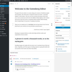
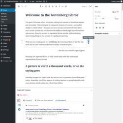
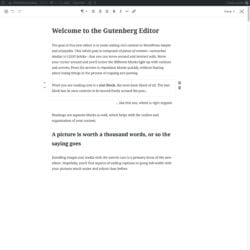
We’ve made some mockups of what we think this could look like (click for larger versions):
Note that we have disabled the background color and text color controls in the block level mockup. These should be off by default in our opinion, and possibly only allow a subset of colors, chosen by the theme author, when enabled.
I’d love to discuss with you, in the comments here, on Github, on Slack: everywhere!


Discussion (74)