How to create and use dashboards in Google Analytics

Google Analytics is a powerful tool. However, it does take quite some time to get used to it, which is why many people are missing out on a lot of functionalities. They simply don’t know some options exists. So today, I’ll explain a feature that I find very useful: Google Analytics dashboards. Here, you’ll read what they are, how to create them and how you could use them. And at the end of this post, there’s a little surprise ;)
What are Google Analytics dashboards?
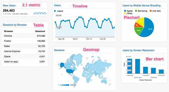
Dashboards in Google Analytics are central spots where you can collect all kind of similar data. You can even decide for yourself how the data is displayed. Let me show you what a dashboard can look like:

Since Google Analytics doesn’t really have a logical structure, the ability to put similar things together at the same place is a great benefit. This means you’ll only have to look at a few places for a general overview of how your site’s doing. Once you set up a great dashboard, there’s no need to dig through all sections of Google Analytics. And that saves you a lot of time….and money. ;
How do I get dashboards?
There are two ways of getting your own Google Analytics dashboards. The first is to make them yourself. Here’s a quick video (without sound) explaining how you can add your own dashboards in Google Analytics :
You can simply play around a bit with adding widgets and creating different layouts for your Google Analytics dashboard. Try to think of a subject and add as much info as you like on that subject in that dashboard. And if you don’t like the result, you can easily delete the widget or the entire dashboard. No harm done! In the last part of the video, I also show how you can add segments to your dashboards. Combining a dashboard with a segment, makes your data even more useful!
Six ways of showing data
There are six ways of representing your data in a dashboard in Google Analytics:
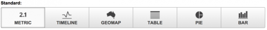
These six representations of your data will look like this:
You can even make the pie chart a donut chart and make the bar chart horizontal instead of vertical. You’ll notice some shortcomings with each representation though. The timeline chart can’t show a total number of visits, for instance. The bar chart is great for comparisons, but it won’t show percentages of the total. However, these charts are still very valuable in making a lot of data accessible at a glance.
But you don’t have to do this yourself!
That’s right; you don’t have to reinvent the wheel! In fact, the dashboards above are based on Google Analytics Dashboards that we’ve downloaded from other people ourselves. There’s a huge gallery of existing dashboards you can import when you click on the ‘Create’ button. You can adjust these existing dashboards and get them to show the data that you think is most useful. There are two Yoast dashboards we created with a lot of info that I think every website owner should have or at least want.
Visitor Insights by Yoast
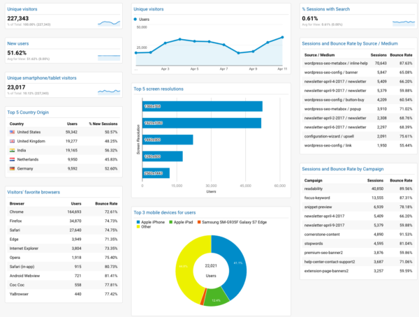
This dashboard includes all the data on your visitors that I consider to be important. How many visitors do you get, how many of them are new, where are they coming from, what devices and browser are they using, etc. All of the data here is very useful when you’re curious about your audience (which you should be!).
You can download this dashboard here.
eCommerce Dashboard by Yoast
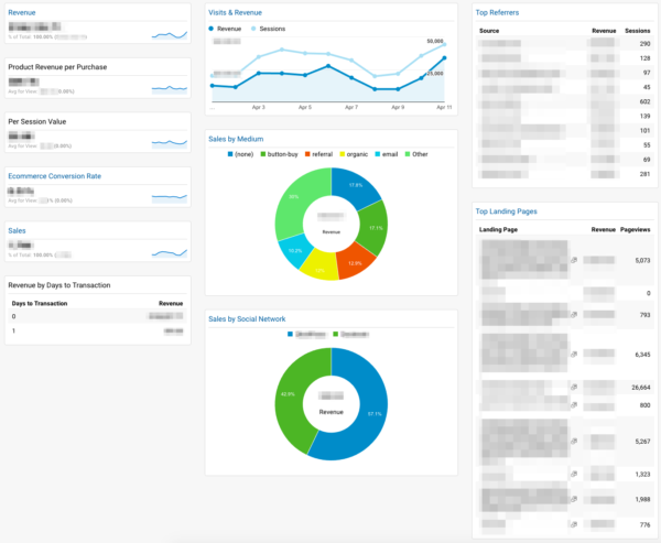
This Google Analytics dashboard includes everything on your sales performance. It’ll give you a quick overview of how much money you’ve made in the selected timeframe, the conversion rate and which acquisition channels and landing pages got you the most money.
I’ve now set the tables to sort by revenue, so the landing pages and referrers that have made the most money will show up on top. However, this should be different if you’re using your Google Analytics, and your dashboards, as a way to spot bottlenecks for your business. In this case, you should sort the top landing pages by the amount of pageviews they’ve had. The more pageviews, the more money it should have made. If there’s a discrepancy, you know which page could use some optimization.
If this is how you use Google Analytics, you’ll probably find that the representation of the tables are the most valuable. All the charts are great for displaying a lot of information quickly, but they aren’t able to show you the worst performing parts of your site. With the tables representation you can sort the data the way you like it, so that gives you a bit more flexibility and more insight.
You can download the eCommerce Dashboard by Yoast here.
Did you learn something today?
Did this post teach you something? Are there any things you’re missing or like to add? Are you already using some pretty cool dashboards and just want to share them? Let us know in the comments!
Read more: Tracking your SEO with Google Analytics »

Discussion (13)