Breaking up responsive design

Over the last couple of weeks I have been dealing with the fine art of CSS. Although that is not my daily business anymore – because I lead the website review team here at Yoast – I really enjoyed mastering SCSS and using that for an actual design. During this field trip, I encountered several front end discussions about responsive web design that intrigued me. They actually fascinated me enough to write this post and invite you to share your thoughts about these issues in the comments. We will all benefit by sharing experience, right?
I’m not Will Hunting, I’m not the only one being able to solve this issue, so I will just write down the steps I took in styling a responsive website for all devices. And am looking forward to your thoughts on this.
First tracks
The first thing I wanted to overcome was the issue of relative font sizes. What would be the best practice and why? As rem seems to be the standard these days, that decision was quickly made. First declare pixels for older browsers, than rem for current browsers.
Being old school, I have been scaling down the browser base font (16 pixels in most cases) to 62.5% for a couple of years now. It is just so much easier calculating up and down from 10 pixels, right? Of course that would mean using a font size of 16 pixels for paragraphs would lead to this CSS:
p {
font-size: 16px;
font-size: 1.6rem;
}
Oh the simple things. But this actually made my browser (Chrome for Mac) show a 1.6 * 16 = 25,6 pixel font before showing the 16 pixels I intended it to be. I wouldn’t put my finger on why this was happening, so I just decided to see how Jeremy Keith was doing this. Ever since Reboot 8 (Copenhagen) I have been following this man from a distance, as he seems to be the no-nonsense guy that just does things the right way. His website does not use the 62.5% ‘hack’, but simply calculates rem font sizes from the 16 pixels standard. The simplest things are usually the best. And yes, I did change my entire stylesheet to match that method. Luckily for me I used a separate SCSS file for font sizes, so this really was a ten minute change ;)
Padding and margin
Second stop was padding and margin. I have been going over this a couple of times, trying to decide on what to use for this: px, em or rem. I must have read a dozen articles on the topic. Of course there are always purists that tell you to always use em for this, but my conclusion was that, as for now, it really does not matter. You just want your white space to look right on all screen sizes. I decided to stick with pixels, as it is just the clearest, most easy way to do this.
There is just one exception in my book: padding-bottom for things like paragraphs and list, perhaps even headings. I use em for that. That might be a personal legacy, or something I an used to, but it seems to make sense to relatively calculate the whitespace below relatively sized elements, as a factor of that element (so using em).
Design your mobile website
With all element dimensions set, I took up the almost impossible task to decide where my design was going to change into the mobile design it should be. I think that is actually step one in responsive design: design the mobile version of your website. Don’t just take the website, reduce browser width to 320 pixels and see how you can make that look good.
Seriously, sit down and try to paint the mobile picture for your website. And all elements in it you can think of. Using Genesis and building plugins ourselves, this meant adding a gazillion (OK, perhaps a little less than that) widgets to a sidebar, scratch that, to all sidebars and styling these one by one.
It will make sure you forget as little as possible. Even writing this post made me realize I forgot one or two widgets, so keep in mind that this is of course also an ongoing process.
With the mobile and regular site designed, it is time to decide where to break your design for different devices.
Breaking up is hard to do
There are two ways to go:
- Breaking up the design using em’s
- Breaking up the design using pixels
Now note that this is not an exact science. As designs differ, these breaking points differ. Again, in my book. Looking forwards to your thoughts and ideas.
Relative breakpoints
The main idea behind using em’s is pixel independency. At the moment, that usually means 1024 pixels is replaced by 1024/16 = 64em. Vasilis van Gemert did an interesting article on Smashing Magazine on these breaking points earlier this year. It also deals with questions like what we should call them (I really don’t care about how we call them, to be honest) and how we could add columns to a layout using responsive design.
 Regarding that last one: that is a really nice extra, but I’m dealing with a blog design here. There is no left Twix, there is just the entire two-piece Raider inside the wrapper: main content and sidebar.
I’m under the impression we have been given tools and feel the need to use all. But when hammering one piece of wood to another for a client, you just need a hammer and nails. In most cases, you do not need a power drill. Your client probably has not even thought of doing things this way. Adding extras should not be a billable hour filler without an actual purpose.
In the article, I especially like the sentence: “If the user prefers a bigger font, then the layout would always be optimized in a way that’s relative to the font size.” I like it because I partly agree. And mainly because it is food for thought. It’s a starting point for nice projects like Marko Dugonjić. But would that work in my real world?
I want a design to look nice and readable on all devices. Vasilis also makes a great, valid point about the length of a sentence, that I wanted to take in account. It simply should be an easy read. The eye can’t cope with long lines, in most cases. I don’t agree with the mentioned conclusion “If you start with a small screen and you grow it, every time the width of the main content grows wider than either 75 characters or 10 words, something should happen. Simply said, these are your breakpoints.” I have been thinking about this when styling a full width page and just decided, after a quick word with our designer, not to make that full width actually full width, but just limited the width of an inner <div> within the main content <div>. But this really is your call. This is simply how we decided to do it.
Absolute breakpoints
As there does not seem to be a fixed set for relative breakpoints, I decided to go with absolute breakpoints instead. Using pixels, you can easily determine where you want the design to break. No calculating, just simple measuring and responding to what the design does.
Most designs are not that complex, column wise, so styling them nicely towards a mobile version is not that hard, just make sure to check every variation possible in your page layout.
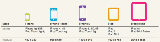
I decided on three screen widths to start with:
- 1024 pixels
- 640 pixels
- 320 pixels
That’s a regular iPad (landscape), an iPhone 5 and up (landscape) and an iPhone (not retina, portrait). Yes, we like Apple here at Yoast. But we also test on other devices, don’t worry ;) I just needed some starting points, on which I would check what design changes where necessary.
The rest is pretty simple. Set your browser to that width, add a media query like this to your stylesheet:
@media (max-width:1024px) {
div.content {
width:67%;
}
div.sidebar {
width:25%;
}
No, these are not exact numbers. Of course the percentages make sure the <div>s are more flexible. Of course you also play with your browser width when styling your responsive website. It’s just easier like that. But let’s not go into those details. Let’s discuss these breakpoints some more.
Now this might be a personal issue, but I think there is nothing wrong with adding multiple media queries to a stylesheet. If you have read or written an article on how adding multiple media queries affects site speed, I’d love to read that, please drop a link in the comments below.
For me, these three breakpoints work like a charm. I have to make a sidenote though: the design has a max width of 1280 pixels, which spreads the breakpoints nicely over the range desktop to mobile.
I do think that, apart from the three breakpoints I mentioned, you should be specific about what width you are targeting, so using a media query like @media (min-width:855px) AND (max-width:1024px) { ... } is totally alright. There will always be gaps to fill in between these breakpoints, and as mentioned earlier, I want a design to look nice and readable on all devices. Now it does.
In conclusion
So, taking all things in consideration, these are the outcomes of me building a responsive template:
- use rem for font sizes and calculate these from the browser default, usually 16px,
- use whatever seems appropriate for padding and margin, which in my case is usually pixels for most block elements and em for whitespace related to text, and
- use pixels to set breakpoints.
Regarding these breakpoints: you should test that. See what works for your design. That brings me to my final question:
What are your experiences with responsive design? At what width have you set your breakpoints and more important: are these fixed sizes for all designs or do you set them again for each new website?
Please add your experiences in the comments below.
Michiel was one of our very first employees and used to be a partner at Yoast. Kick start your site optimization with his articles!
SEO for beginners webinar
Looking to understand SEO? Our 'SEO for beginners' webinar covers fundamentals, keyword research, and practical tips to get started.
All Yoast SEO WebinarsWordCamp Asia 2026
Team Yoast is Attending, Sponsoring, Yoast Booth at WordCamp Asia 2026! Click through to see who will be there, what we will do, and more!
See where you can find us nextSorry! We don’t have a podcast planned at the moment.
Keep an eye on our site and social media to stay up-to-date.
All Yoast SEO Podcasts
Discussion (60)