Case study: SEO of a photographer’s site

Writing about SEO is easier than implementing best practices on a website yourself. Every site is different and every type of site presents its own challenge. We know that, and that’s why we started our Yoast Case studies, in which we scrutinize an existing site and give the owner practical advice on how to optimize it. In this third case study: SEO of a photographer’s site.
Photography and SEO
In this case study, we dive into the site of a photographer: geoffwilkings.com. Geoff is curious what he could do to improve his website’s SEO. He’s told us he’s 100% about photography and photos but knows he needs textual content to rank. He does have a blog and he wonders if he is writing clear enough for prospects and search engines. Let’s have a look at different aspects of his photography website to see what’s good and what needs improvement.
Of course, a website is a work in progress, so while we reviewed his site, Geoff already made some changes to it. This means that what you see on his site might differ a bit from the screenshots below. But we’ll keep them here because we think they serve as nice examples!
Every website needs content to rank
Photos vs. textual content
It makes sense that photographers want to present their work on their website. The photos show their style and by adding lots of photos, they try to convince visitors of the quality of their work. Displaying great photos will, of course, increase the chances of people wanting to hire you, as a photographer. But what does it mean for SEO?
Adding content is one of the main things you need to do to make your website rank, as you might know. The content shows the search engines what the website is about and for what queries it should rank.
Content can consist of textual content but also photos, images and videos. For search engines, textual content is the most valuable content; it helps them determine what the website is about. So, for a photographer’s website, it’s essential to make sure there is enough textual content for the search engines to understand what every page is about.
Geoff’s site
If we look at Geoff’s website, we are in awe of his skills as a photographer: such beautiful pictures! You might just want to get married to get some fairytale-like photographs like that ;-)

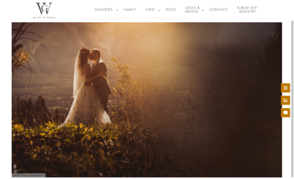
There are things he could do though, to make his photos better findable. If we look at his gallery page, for example, we only see one photo on the URL:
Although Geoff added a great filename to the photo, a clear alt text and all the other meta data, it’s still hard for search engines to determine why this page should rank above other pages. Besides that, this gallery page contains only one photo, and therefore Google probably considers it a thin content page, leading to lower rankings. Lastly, since every photo is on a new URL, it’s harder to make all these different URLs rank.
To make these URLs rank there is a need for textual content, so we recommend adding relevant information about things like location, the couple, the theme and other nice things about the specific wedding. By adding textual content, it’s also possible to add an H1 heading to every page which is beneficial for SEO. Lots of pages don’t have an H1 heading at the moment.
After providing this feedback to Geoff we understood that there was some content, but it’s hidden. You can find it if you click on the comment icon on the right side of the photo. Unfortunately, we can’t view this content in the source code, which means Google can’t see it either. So we’d recommend to add it below the photo. Using keywords like wedding photography and the location might help him rank locally.
Improving User Experience for more conversions
Usability and SEO
Improving user experience is increasingly important and should go hand in hand with working on SEO because Google uses ‘user signals’ to determine the relevancy of a website:
If visitors leave your website very fast, search engines consider this a negative signal, because the website probably doesn’t show the information the visitor is looking for. On the other hand, spending lots of time on a page is a positive signal and search engines might rank you higher. This kind of data helps Google to determine the relevancy of a website for a specific search term. Google wants to show the best result on top of the search result pages and if your website is user-friendly, Google will notice this in the user data.
Geoff’s homepage
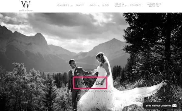
Looking at the homepage of Geoff’s site – again, such a beautiful picture! – we think a clear call-to-action is missing. It could be that the ‘Enter here’ is meant as a call-to-action, but the ghost button makes it very hard to read:

On top of that, ‘Enter here’ is not the best text for a call-to-action and if you click on it, you’ll end up on a gallery page. We recommend adding a call-to-action button with a text such as ‘Hire us’ or ‘Check if we’re a good match’ or ‘Contact us’, which leads the visitor to the respective page with more information.
Another improvement for the homepage is the formatting of the text. At the bottom of the homepage, we noticed a lot of text and the font of this text seems to be quite small. We recommend using a minimum of 16px to make sure it’s easy to read for visitors. Also, Geoff might want to use copy like this on other pages than his homepage, because ranking with other – more specific – pages than a homepage might be a more feasible strategy.
Geoff’s menu
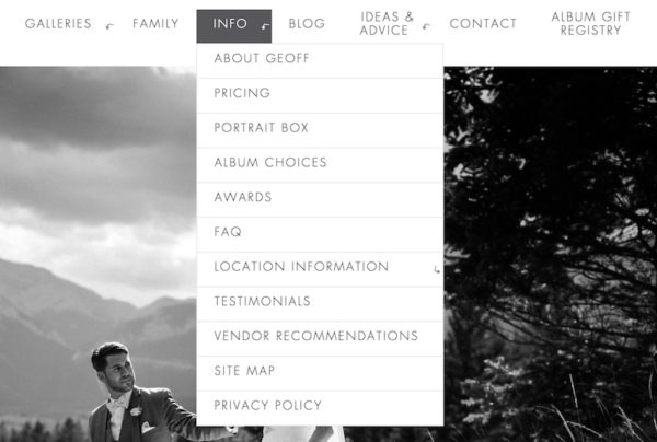
Looking at the menu of the website, we believe there are too many options. To provide a good user experience, visitors need to find in a few seconds what they’re looking for. Offering too many choices makes this harder. Geoff could, for instance, consider cutting down the number of sub items in the drop down menu of ‘Info’.

Value of a blog
Blogging and SEO
Having a blog can be beneficial for your site’s SEO because it’s a possibility to add new content regularly, which Google likes. On top of that, it enables you to add more relevant content with internal links to your other pages which makes it easier to rank. Lastly, when other websites think that your blog posts are valuable and relevant to their websites, they’ll probably add a link to your blog. Increasing the amount of backlinks to your site helps a lot when you want your site to rank.
Geoff’s blog
Since we’re blogging a lot at Yoast, we’re always curious to see blogs of other websites. We were so excited to find out that Geoff’s website has one! Clicking through to the blog, however, tempered our excitement: the blog opened on another domain. This, unfortunately, means that the value of the blog doesn’t add much value to Geoff’s main website. We advise Geoff to move his blog to his main domain, a better URL to use would be, for instance, geoffwilkings.com/blog.
In addition to moving the blog to the same domain, we’d advise choosing a different layout for the blog’s main page. Now it just shows just a large video above the fold. But when visitors navigate to your blog, they want to see what kind of posts you write and probably get inspiration. We recommend showing some excerpts of Geoff’s blog posts above the fold to make sure visitors know immediately that they landed on his blog.
When clicking through the blog posts, we did like what we see! For instance, some nice atmospheric posts about shootings for an engagement and a wedding, and a good explanation about retouching photos.
Technical SEO improvements
Let’s dive into the technical SEO aspects. We’ve crawled the website to check whether there are huge problems. We need to say that the website is doing a pretty good job! The only thing we’d like to mention is the use of canonicals. We noticed that most pages don’t have a canonical. At Yoast, we prefer to have a canonical on every page, so we’d advise having self-referencing canonical URLs. Joost explained this very well here: rel=canonical: the ultimate guide.
Is it possible to have a fast loading website if you have lots of high-quality photos?
Speed is often an issue on photographer’s websites. Because of the file size of the images, those websites tend to load quite slow. Since page speed is an actual ranking factor, it’s important to make the website as fast as possible. Analyze your website with the Google PageSpeed Tool and if the tool tells you that you need to optimize images, do so. This can be beneficial for your site’s SEO.
We did this check for Geoff’s site and we were pleasantly surprised! The website has a score of 73/100. Of course, Geoff can improve this score, but we can tell you, we’ve often seen photographer’s websites with scores below 50. The tool recommends to ‘Optimize images’, but it only mentions one image mentioned, so good job!
Are you a photographer as well and are there more images mentioned in the tool? In this post about image optimization, we’ll explain how to reduce the file size of your images, but maintain the same quality.
Lastly, there are some improvements to make regarding the use of JavaScript and CSS, in optimizing browser caching and enabling compression. We recommend Geoff to work on these issues (perhaps together with a developer) to make his website lightning fast!
Finding a photographer on a mobile phone
Imagine you’re getting married. Right after you decided to get married, you probably grab your phone for some inspiration and ideas! This means that as a photographer, you need to make sure your website works just as well on a mobile phone as it does on a desktop.
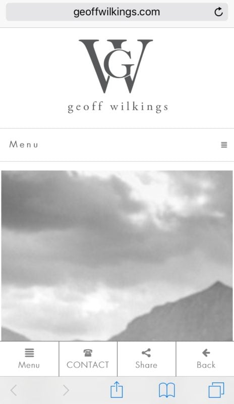
Checking the website of Geoff on a mobile phone, we noticed that no content is visible above the fold – the part of the website that is visible without scrolling. This means that the website looks like this:

You probably understand that this view isn’t very attractive to visitors who visit the website for the first time. Grab the attention of the visitor immediately by adding some introductory content and a call-to-action. Or a stunning photo with a call-to-action. We recommend checking your website on mobile regularly to see whether you can use the same content as on the desktop.
We provided this feedback to Geoff and we’re really happy to hear that he already changed this! You’ll now see a much better version of his homepage on mobile!
Our summary for Geoff
We enjoyed checking your website, Geoff. You have some stunning photos on your site, and that’s, of course, the best basis for a photographer. On top of this, you run a blog! Our most important recommendation is to move your blog to your main domain, so the value of it contributes more to your site.
Furthermore, you could improve the call-to-action on your homepage, simplify your menu a bit and add more (textual) content to your gallery. And last but not least, try to give your mobile users an awesome experience too. For the rest, keep up the great work!
Read more: Blogging: the ultimate guide »


Discussion (15)