Case study: SEO for a quality brand

With our Ask Yoast case studies we helped clients with their SEO by reviewing the website and giving clear advice and hands-on tips. Those clients send us their website because they’re curious what improvements can be made to improve the overall rankings. This time, we reviewed the website of a high-quality sun protection brand: Calypso. The brand started many years ago in the UK but is nowadays sold all around the globe. Let’s dive into the website to see what they’re doing well and what things need improvement.
A clean entrance
On entering the website, we immediately see a clean and inviting homepage. The homepage makes sure visitors can easily navigate to the most important content of the website: the actual products. However, we also see things that can be improved.
First of all, we see the slider on top of the homepage. We’re not a big fan of sliders because different studies show that only around 1% of your visitors would actually click on a slide. Besides, sliders often slow down your website a lot, and there are a lot more reasons which you can find in the post linked above.
We think the slider on Calypsosun.com is even more confusing because it contains a video. When a visitor presses the play button within the video, he or she is sent to the video on YouTube:
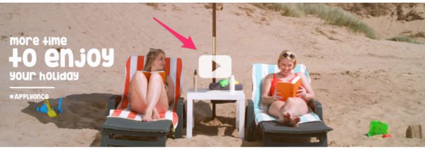
This means that you say goodbye to your visitors in an early stage of their visit. Try to keep them on your website and send them to your content.
What is the best practice in this case? In our eyes, another image, which is now below the fold on the homepage, would be a great top image:

The image contains some introductory content which tells your visitors what’s on the website. Adding a clear call-to-action below this image would be great. Think of a button with a text such as ‘See all products’ to guide your visitors to the product overview page. Below this call-to-action, you can still show the top sellers as you do now.
What are the site’s pages about?
Google needs to understand what a website’s pages are about before the pages can rank for certain keywords. Of course, textual content tells Google what a page is about. An important part of your text are the headings. Headings are meant to tell Google what the main subject of a page is and what other relevant subjects are on the page. This means that the main subject of a page should always be an H1 heading. Subheadings in the text should be H2 or H3 and less important headings should be H4, H5, etc. We recommend using H4 and higher for headings in a sidebar or footer because Google shouldn’t use those to determine what the page is about.
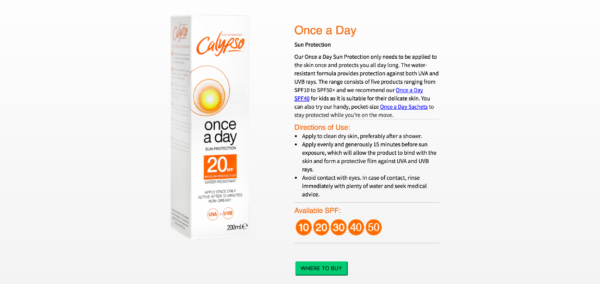
For example, checking one of the product pages of Calypso, we noticed there is no H1 or H2 heading.
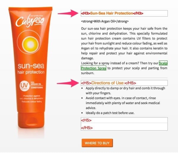
The name of the product is an H3 heading, but this should be the H1 heading. The subheading ‘Directions of Use’ doesn’t tell so much about the subject of this page so this could indeed be an H5. When the subheading is relevant to the text, it should be an H2 of H3 heading.
Another way of telling Google what a page or post is about is optimizing your site’s metadata such as page titles and meta descriptions. We noticed that Calypso uses great page titles and meta descriptions so they’ve already understood how important this can be for SEO.
Making your pages stronger
It’s clear that every website needs content to rank for certain keywords. If content is well-structured with headings, and page titles are optimized, it’s time to make your most important pages stronger. For Calypso, their product pages are most important because these reflect the products the company is based on. In this case, the product overview page could benefit from a little more SEO-optimized copy.
You might think that blog posts on the website are less relevant. However, blog posts can be valuable in another way, which we’ll explain in the next paragraph. You’ll always have important content and less important pages and posts, but even those have their purpose.
Let Google know what’s important
How do you let Google know what pages are more important? By adding internal links from all relevant pages to the most important pages, you make those pages stronger. When a certain page has lots of links from relevant other pages, Google understands that this page might contain the most important content around a keyword. Make sure you add relevant anchor texts to the internal links to make Google understand for what keywords the most important pages of your website should rank.
For example, when you write a blog post about the best sun protection for kids, you should add internal links to the actual products. If you use anchor text such as ‘Sun protection for kids’, it will be clear to Google what the relevancy between the pages is. Doing this consistently, your product pages will get more and more links and will become the strongest pages of your website.
The ‘Be Sun Ready’ page could be a great cornerstone article for ranking on relevant keywords. This page, however, could benefit from a few optimizations: they could add links to relevant products in the content and a call-to-action-button to the products page. Doing keyword research should provide them with enough keyword suggestions to make this great page SEO-proof.
The products overview
Navigating to the product overview page, we noticed that the categories are visible in tabs above the products:
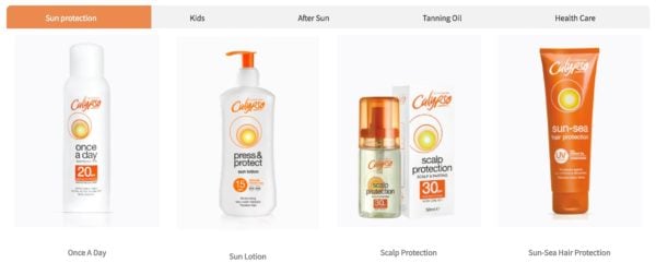
We recommend adding narrow signs to make sure visitors understand that more content can be found clicking on those tabs.
You’ll see that these signs will make it clearer to your visitors that they can click on the tabs. Make your site as user-friendly as possible, because the signals users provide are precious as Google uses these as well in their algorithm. Since SEO and UX are increasingly tied, it’s important to improve those user signals.
Using buttons to guide your visitors
Clear buttons can have a positive effect on the page path visitors take. You can guide your visitors to the pages you want them to go to next page. For example, you could add a button below each product which says ‘More information’. Doing this, you guide the visitors to the specific product pages and you make sure visitors understand that they can find more content related to the product by clicking on it. Now, the only way visitors see that there is a link behind the product on the current overview is by hovering over the image.
The product pages already have clear calls-to-action added: buttons which say ‘Where to buy’:
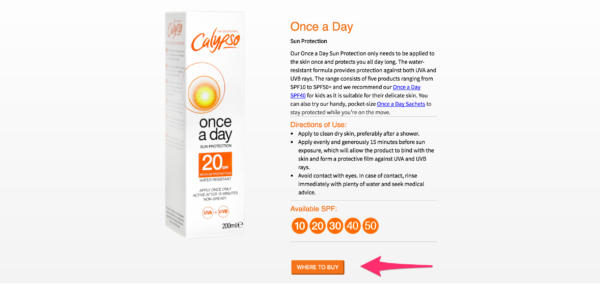
However, there is a way to increase the number of clicks on this button. We recommend changing the color of the button into a color that’s not in your color scheme. Doing this, the button will stand out more and might get more visitors to click on the button. Don’t you think the button catches your eye when it’s in another color?
Of course, if you have a sufficient amount of traffic you can – and should – do A/B tests for these kinds of things. After an A/B test, you can easily conclude what color works best.
The last tip we want to give for the product page is related to the ‘Where to buy’ section. After clicking on the button, a screen pops up with the names of all the different resellers of the products. However, the only supplier which contains a link is Amazon and this logo is placed at the bottom of the popup screen. When visitors come to your website, they are already online, and they might immediately want to buy your products online. This means that it could be a good idea to guide them to Amazon first to give them the opportunity to buy your products directly.
Make sure your website loads fast
An important issue on the website of Calypso is page speed. Page speed is crucial in the eyes of Google and is considered to be a ranking factor in the future mobile-first index. The longer it takes to load a page, the less user-friendly the page is. Probably you’ll agree that it can be annoying if you have to wait too long for a web page to load. Visitors will bounce because of the loading times and this is a negative user signal, like we mentioned before.[
Testing the website of Calypso in the Google PageSpeed Tool we noticed a very low score: 18/100. This means you’ll have to start working on the loading times of the website. All possible improvements regarding speed are listed in the Google PageSpeed tool. We recommend starting with enabling compression and with optimizing images. Resolving those two issues probably results in the quickest and easiest increase in the page speed score.
To sum it up
We really loved reviewing the website of your well-known sun protection brand. You’ve created a very clean and clear website and with a couple of changes, you can improve your site’s SEO as well.
For your homepage, we recommend removing the slider and instead, add a clear image which reflects the website. Some introductory content will tell your visitors what the website is about and with a clear call-to-action you can guide your visitors to the most important pages.
To make those crucial pages even stronger, we recommend setting up an internal linking strategy. Make sure your internal linking reflects the hierarchy of the website to help Google understand the site structure. Besides that, using the right headings will improve the site structure as well.
And last, but definitely not least, working on your site’s loading times can be very beneficial. Increasing the page speed score will be valuable for both your visitors as for your site’s SEO. Good luck!
Caplyso replied to our SEO review
“We found Yoast’s advice about our website very helpful and they explained clearly the changes we needed to make in order to increase our web traffic. We have already started making changes to the website, particularly on adding more keywords and improving the loading times. We would recommend every company have their website reviewed by Yoast so they ensure it’s SEO and user-friendly.” – Sina Joneidy


Discussion (39)