Case study: SEO for architect websites

In this Ask Yoast case study: the website of Slemish Design Studio Architects, the business site of an architect duo. The architects told us that they get great responses from their clients, but is their website optimized for search engines as well? We’ll dive into this architectural website to see what improvements can be made to enhance their site’s SEO.
First impression
The first page we land on is the homepage. We see lots of full screen images of the great work these architects deliver on top of the homepage. Though impressive, the images are shown in a slider. Loyal readers of our blog know that we’re not a big fan of sliders. Many experiments show why you shouldn’t use a slider on your website. Only 1% of your visitors will actually click on a slider, they slow down your website and lots of visitors ignore sliders because of banner blindness. Just to name a few.
Looking at this specific website, the slider images are very big as well. The textual content of the homepage is pushed down. We recommend showing some smaller images on top of the site, instead of the slider, and adding some clear introductory content just below these images. Try adding your USPs to the introductory content: Why should visitors choose you as their architect?
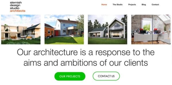
Lastly, by adding a clear call-to-action just below the introductory content you’ll make sure visitors can easily navigate to your most important pages. For example, you could think of a button which says ‘Get inspired by our projects’ or ‘Our services’: decide what the main goal of your homepage is. Just to show you the difference, we’ve created a mock-up of how the homepage could look like after following our advice:

Beautiful images, too little text
On the ‘The Studio’ page, we notice a tab ‘What we do’. This tabbed content tells visitors what kind of work you do and what type of services you offer. Because of the relevancy of this content, we think these services deserve their own menu item. Visitors who want to know more about your team and your company may click on ‘The Studio’. However, they might not expect to find the services you offer there.
In addition to that, your services are great subjects to write about. Writing nice informational copy about your services will increase your chance of ranking for keywords related to these services. When you add sufficient relevant content, Google will understand that your website has content for people looking for services like yours. This means those people will easily find you. The more your content seems to fit to the needs of people who search for these keywords, the higher you’ll rank in the future.
Make sure you optimize one specific page or post for one subject/keyword. When you optimize one page for more keywords that are too different, it’s unclear for Google what the main subject of the page is. Pages that contain a lot of information about the keywords you really want to rank for, should become your cornerstone content pages. This blog post about cornerstone content explains in detail what cornerstone content means and this blogpost shows you how to incorporate cornerstone content into your website.
Lastly, we think you can improve your content as well by adding more copy to your project pages. Consider writing a nice text about the planning stage of the project, the building stage and the delivery stage of the project, for instance. In this copy you can add relevant keywords for your business. In addition to that, this allows you to internally link to your cornerstone content pages from your project pages.
Structure your text
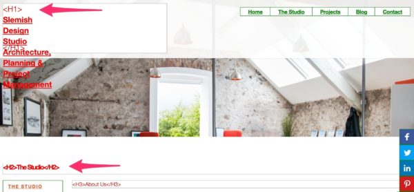
When you decide to write more copy for your website in the future, make sure the pages and posts have a great heading structure. On your current pages and posts, we noticed that your logo is an H1 heading. However, the H1 heading should describe the main subject of a particular page on your site to help Google understand what the subject of that specific page or post is.
For example, checking ‘The studio’ page, we see the following headings on top of the page:

Your company name/logo has an H1 tag now, which means that your company name would be the main subject of this page. While in fact, ‘The studio’ is the main subject of the page. So you should change the H2 heading of ‘The studio’ into an H1 heading. Just remove the H1 heading from the logo on every page of the website. We’d advise to check all of your pages and posts and only add one H1 heading, that describes what can be found on there, on each page.
Read more: SEO basics: how to use headings on your site »
The right metadata
You’ll need to add relevant keywords to your page titles to help Google understand what your pages are about. Since page titles are still one of the most important ranking factors it’s important to optimize those to the fullest.
Looking at the page title of your homepage, we think you’ve added too many different keywords to show what your website is about:

Adding all different locations to your page title makes it unclear what your website is about. Moreover, the snippet doesn’t look very enticing to click on in the search results. This might cause a low CTR, or click-through rate. If you want to rank for all the different locations, adding separate pages with unique page titles and content for every location would be a better idea.
We’d advise to create appealing page titles and make sure they describe what can be found on that specific URL. For the homepage, use your USP and add a call-to-action such as ‘See our projects here’ to make people click on your page in the search results. Don’t you think a snippet like this will be more appealing to potential visitors?

On top of that, it’s important to be consistent in your branding. Add your company name to every page title. If you do that, people will recognize your page in the search results more easily, because of the brand name in every page title.
Add more relevant content to your blog
Having a blog can be very beneficial for SEO. Adding posts regularly makes it easy to add content about relevant keywords to your website. It helps you to start ranking for new keywords and to keep ranking for the keywords you already rank for.
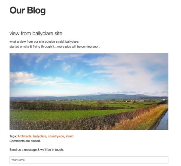
Slemish Design Studio Architects have a blog and they add new posts regularly, which is great. However, it seems that lots of posts have little textual content. For example, this post only has two sentences:

Google could consider this post as a thin content page, which could hurt your website’s rankings. Since pages like these don’t add much value to your website, you’d better add more content or remove them from your website.
Keep reading: Blogging: the ultimate guide »
Create strong cornerstone content
Besides the benefits of adding more content about relevant keywords to a blog, a blog also gives you an opportunity to add more internal links to your most important pages and posts. For example, when you’ve created a separate page for the service ‘Sun Rooms’ you could write a blog post about new innovations for sun rooms. From that post you can add an internal link to the page about the ‘Sun Rooms’ service. Doing this consistently, that service page – which could be a great cornerstone content page if you add sufficient content – will become a better search result, according to Google.
In addition to internal links within a text, you can add a popular, recent or related posts section to the blog. The sidebar is often used to add sections like these. These links in the sidebar will give the posts they link to some extra link value.
Lastly, adding your blog’s categories to the sidebar will give your category pages some more link value too. Consider doing this if you want to rank with your category pages.
A fast loading website
The longer visitors have to wait for your website to load completely, the more likely it gets that some of them will ‘bounce’ back to the search results. A long loading time frustrates visitors, so they might leave your website before seeing any relevant content. Google uses bounce rate, among other things, to determine if a website provides visitors with a good result. When lots of visitors bounce back to Google’s search results quickly, that isn’t a good sign. You might understand that this can harm your rankings.
On top of that, page speed is an actual ranking factor. Google understands that a website with bad loading times probably isn’t the best result. Similar websites that load faster are likely to end up higher in the search results.
We’ve tested the website of Slemish Design Studio Architects and we found a score of 24/100. The score is in red and this means that there’s work to do! Just follow the advice Google gives in the page speed tool as this leads to both a better user experience, as well as better rankings.
To sum it up
It was a pleasure analyzing the website of this architect duo. You show some amazing work in the images on the website! Adding a cleaner homepage with a clear call-to-action could result in more conversions, so more actual clients. Also, specific pages for all your services could be valuable for both Google and visitors.
Basically, our most important SEO advice is: make sure Google understands what your website is about. This means you’ll need to write relevant content about keywords you’d like to rank for. Furthermore, optimizing your site’s metadata – like titles and meta descriptions – and headings would be beneficial. With internal links you can connect your content and give your most important pages extra value.
And last, but definitely not least, making your website load faster will really improve your site’s SEO and user experience!


Discussion (11)